Optimizing Enterprise Navigation & Search

Redesigned enterprise navigation and search to improve usability, account visibility, and product discovery.
Project Scope
Context
The header supports a high-volume B2B labware catalog with deep category nesting and search-heavy behavior.
Problem
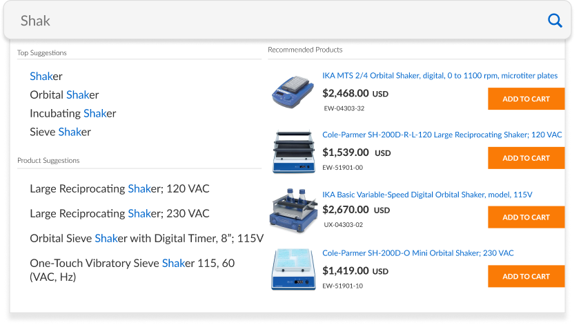
The website’s outdated header became the first priority as the site expanded. Lacking clear hierarchy and visual structure, it felt dense and overwhelming. The undersized search bar further reduced visibility and usability, creating friction at the very start of the user journey.
Constraints
The mega menu architecture could not be modified due to backend dependencies.
Category structure and SEO labels had to remain intact.
Changes needed to be lightweight and development-friendly.
Goals
Widening the search bar along with the overall header width.
Improve focus on Accounts to increase Account Awareness
My Responsibilites
Owned the end-to-end redesign of the website header, identifying usability and hierarchy challenges as the site scaled. Explored layout solutions through wireframes and prototypes, then translated the final design into production using HTML, CSS, JavaScript, and Razor. Restructured the header within an expanded 1440px framework to create a more balanced and scalable foundation across screen sizes.
The Result
The redesigned header created a clearer visual hierarchy and a more scalable foundation as the site expanded. Increasing the header width to 1440px improved balance and spacing, while a more prominent search experience made navigation more intuitive. These improvements contributed to a 5% increase in user searches, signaling stronger engagement at the very top of the user journey.
The Research
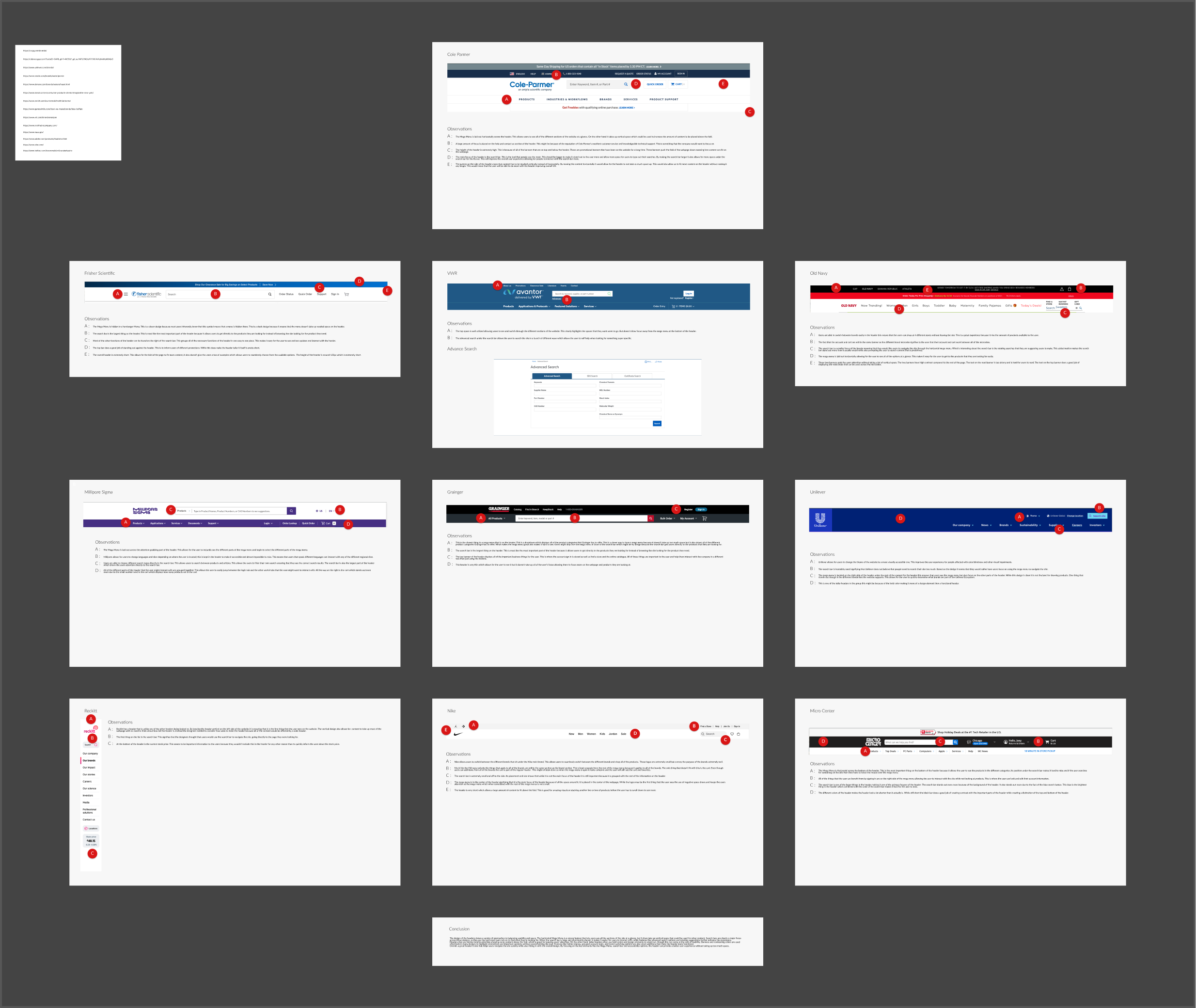
Research focused on understanding how users interacted with the header and identifying navigation friction. Data showed that search was one of the most frequently used tools on the site, reinforcing its growing importance as the product catalog expanded.
A competitive analysis of e-commerce sites both within and outside the industry helped identify best practices in hierarchy, navigation structure, and search prominence. User behavior was analyzed through Glassbox session recordings and heatmaps to determine which elements received the most attention and where users hesitated. These insights informed a clearer, more scalable header design..
The Design Process
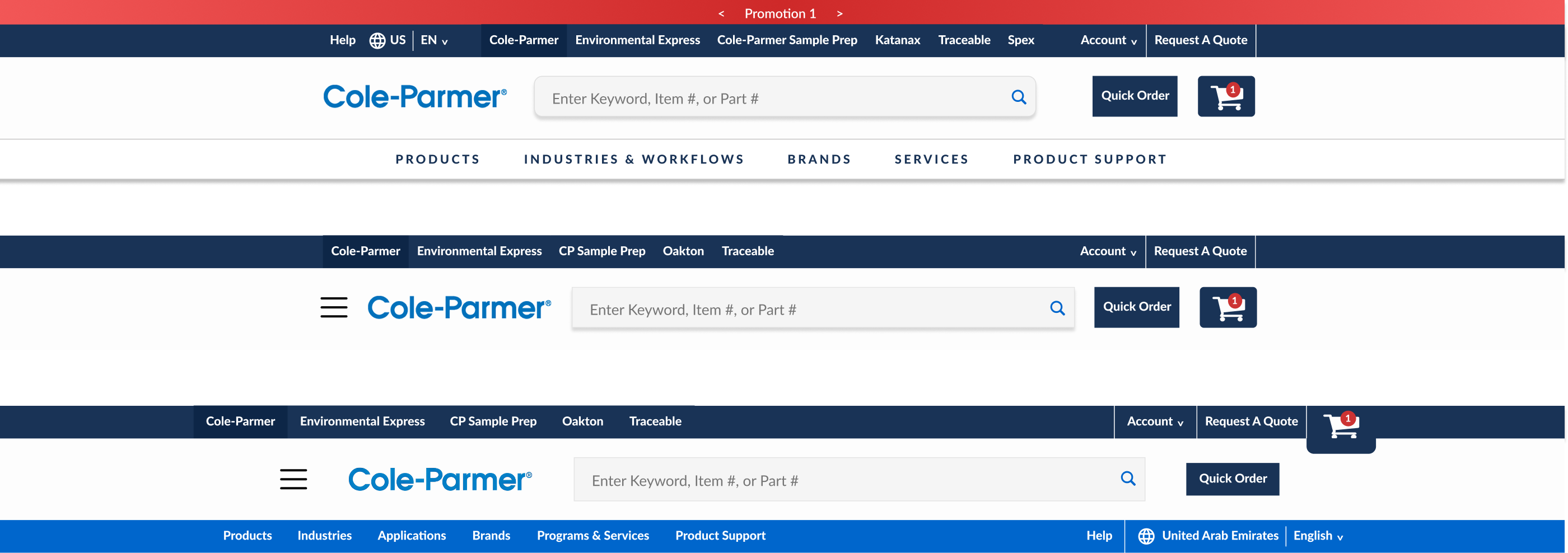
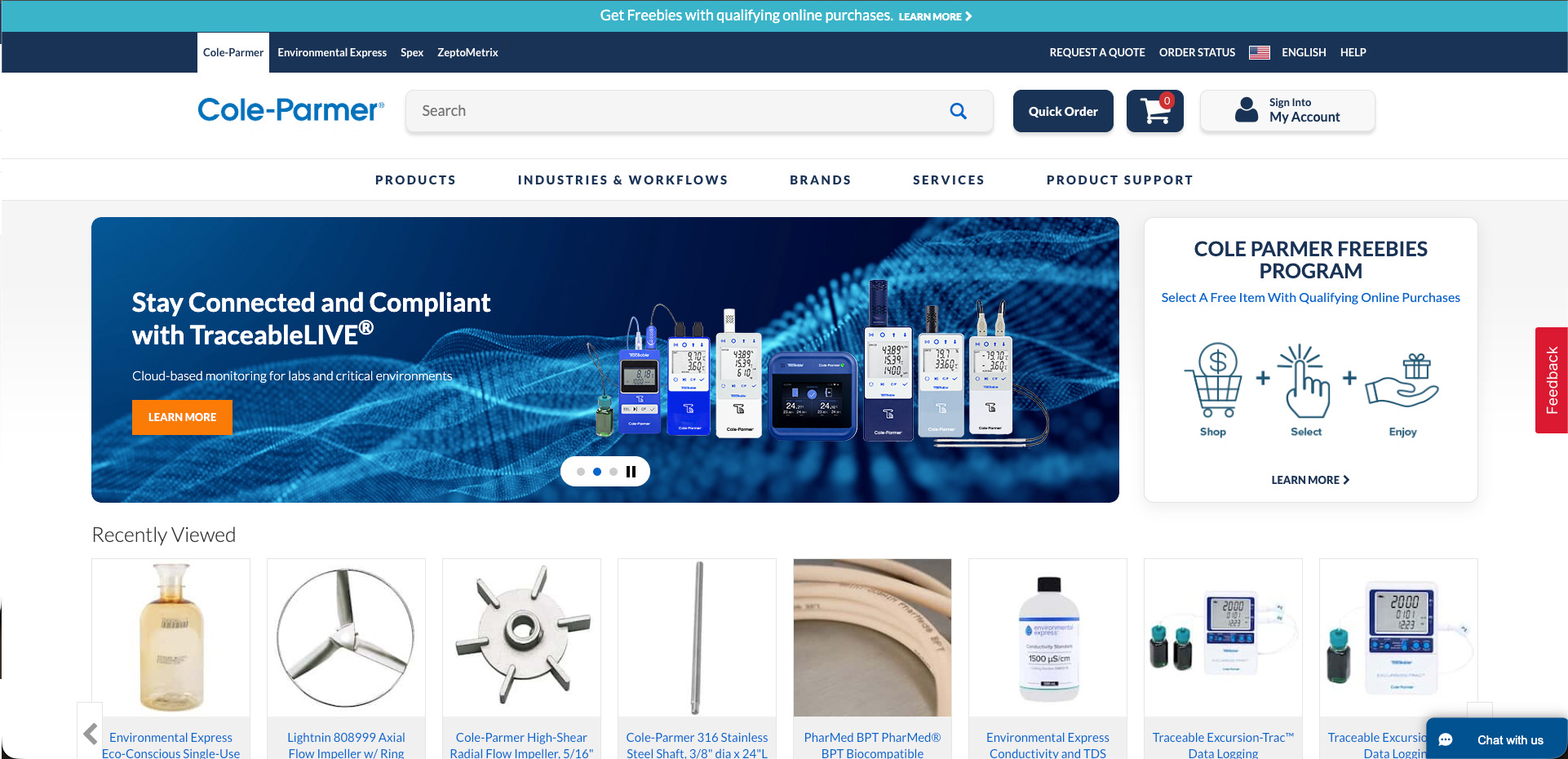
The redesign took place over several months and began with aligning on clear goals with key stakeholders. Early discussions established that the search bar needed to be more prominent, along with the account center, since both play a key role in how customers navigate and return to the site.
At the same time, there were important constraints to consider. Features like Quick Order and the cart are essential to existing workflows and could not be moved or changed significantly. The top banner highlighting manufacturing and affiliated ecommerce sites was also reviewed and refined for better clarity while maintaining its purpose.
With these priorities and limitations in mind, the focus shifted to improving hierarchy and organization within the header to ensure key elements stood out, while keeping the experience familiar for returning users.
Initial & Redesign

Initial Design
Redesign
The Development Work
Beyond designing the solution, the redesign was implemented directly in production using HTML, CSS, JavaScript, and Razor. Translating the design into code required careful consideration of the existing architecture, particularly the fixed mega menu structure and backend dependencies.
The header was rebuilt within an expanded 1440px framework to improve alignment, spacing, and scalability across large enterprise screens. Rather than altering the underlying navigation system, the focus was on restructuring layout containers, adjusting proportions, and refining visual hierarchy to elevate search and account visibility without disrupting established workflows.
Owning both the design and implementation strengthened the final outcome. Working directly in code allowed for tighter control over spacing, responsiveness, and interaction details, while ensuring the solution remained lightweight and feasible within development constraints.
Key Take Aways
This project reinforced the importance of balancing innovation with constraint. Improving usability did not require a complete overhaul of the system, but rather a thoughtful refinement of hierarchy and spacing within existing limitations.
Prioritizing search and account visibility demonstrated how small structural adjustments at the top of the experience can meaningfully impact engagement. The 5% increase in user searches validated that improving clarity and prominence can drive measurable behavioral change.
Most importantly, the project highlighted the value of grounding design decisions in user behavior, technical feasibility, and stakeholder alignment to create scalable, long-term improvements.
Check Out Some More Of My Work

Optimizing Enterprise Navigation & Search
Redesigned enterprise navigation and search to improve usability, account visibility, and product discovery.
C-PRISM
Cole-Parmer Resource for Interface & System Management
B2B Product Page Redesign
Restructured key product information to support faster decision-making and a more intuitive buying experience.
Visual Search for Complex Catalogs
Created a streamlined visual search flow for navigating large, high-SKU catalogs.
Homepage Redesign
Modernized a legacy homepage to improve clarity, visual hierarchy, and conversion performance for a high-traffic B2B website.

Augmented Reality Interface for NASA
Developed an AR interface prototype for the NASA SUITS competition.