Visual Search for Complex Catalogs
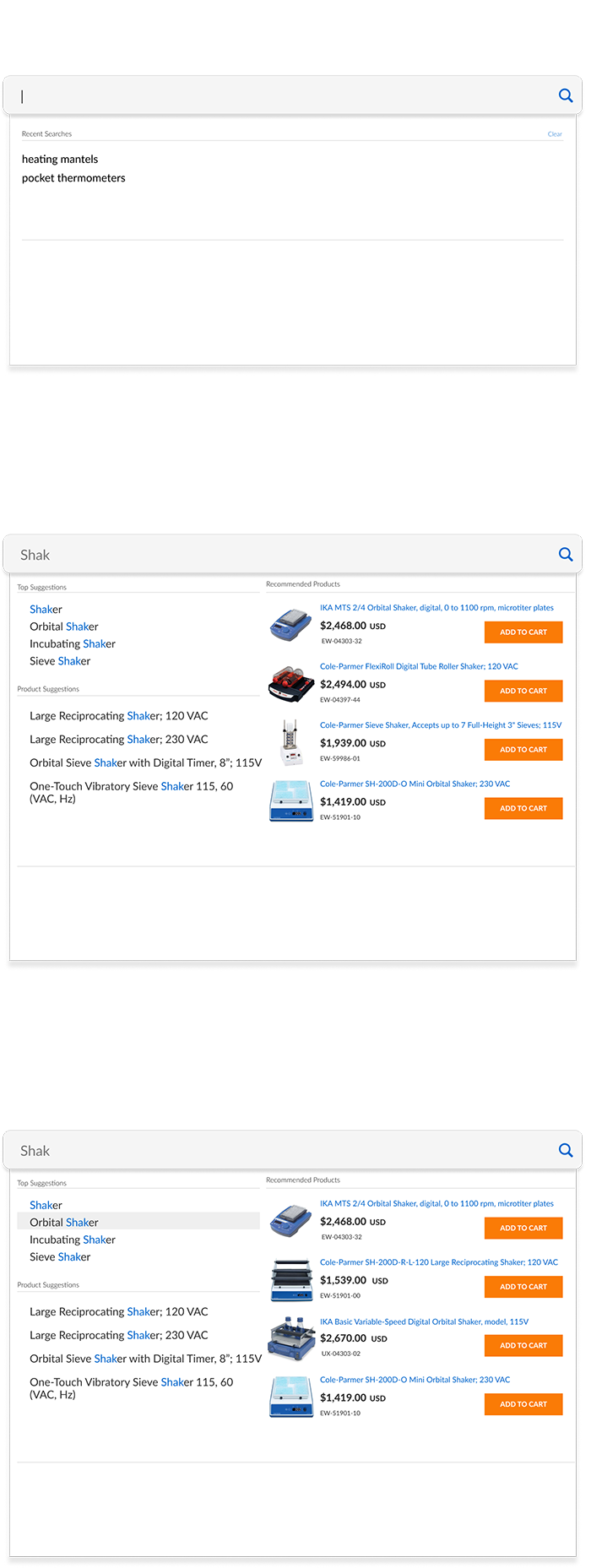
Designing clarity within complex product ecosystems.
Project Scope
Context
The global header search served as a primary entry point into a catalog of over 40,000 SKUs with highly technical specifications. As part of a broader modernization effort, the search experience was reevaluated to improve clarity, speed, and purchasing efficiency within complex product categories.
Problem
Keyword-based search returned a high volume of similar items, often overwhelming users with dense result sets. Technical naming conventions and subtle specification differences made it difficult to quickly identify the correct product. Search results required multiple page visits to compare items, increasing friction and slowing purchasing decisions.
Constraints
Integrated within the existing global header and search infrastructure.
Required support for 40,000+ SKUs with complex specifications and variants.
Limited development bandwidth required focused, high-impact improvements.
Goals
Improve clarity within dense search results.
Reduce cognitive overload in high-volume categories.
Surface the most relevant and commonly purchased products first.
Enable direct add-to-cart functionality from search results.
Increase conversion efficiency within the search experience.
My Responsibilities
Led the UX strategy and interaction design for the visual search experience within the global header. Developed wireframes and high-fidelity prototypes to define layout structure, hover behaviors, and add-to-cart interactions. Designed the rule-based prioritization logic to surface top-performing SKUs within search results and conducted usability testing to validate clarity and performance improvements.
The Result
The visual search redesign reduced cognitive overload by surfacing high-relevance products and key specifications directly within results. Direct add-to-cart functionality streamlined repeat purchasing behavior and minimized unnecessary page transitions.
The updated search experience contributed to a 10% increase in search-driven revenue, demonstrating the impact of improved clarity and decision support within complex catalogs.
Research
Behavioral analysis revealed that search users frequently encountered long result sets containing visually similar products with minor specification differences. Session observations showed repeated product page visits and back-and-forth navigation, indicating friction in identifying the correct item.
Search data further showed that a small percentage of SKUs represented the majority of purchases within high-traffic categories. These insights informed a rule-based prioritization strategy that surfaced the most purchased products within the visual search results, reducing noise and improving immediate relevance.
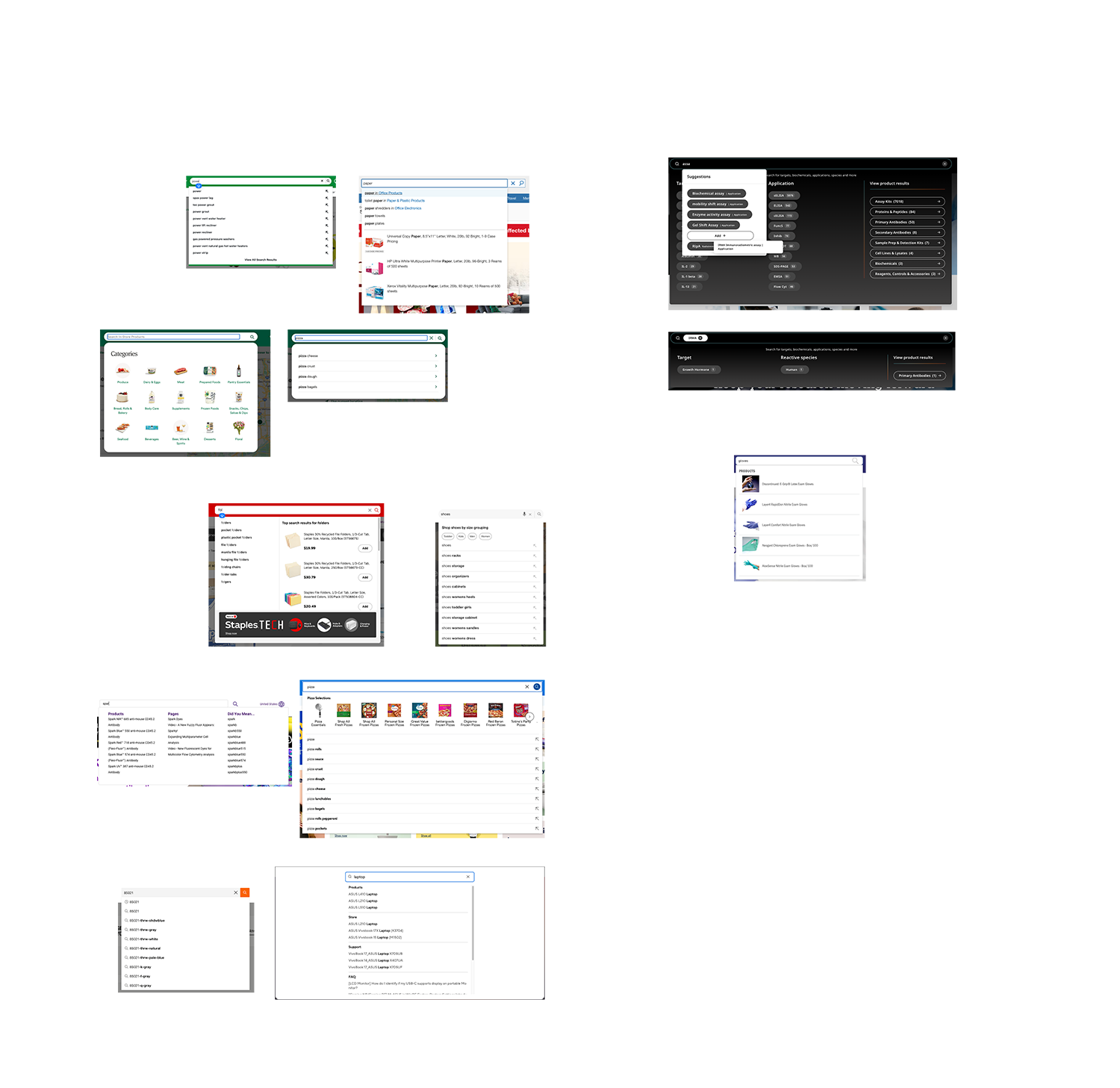
Competitive analysis of modern eCommerce platforms highlighted the importance of image-forward search layouts and quick-action purchasing. These patterns informed a redesign centered around visual clarity, specification previews, and streamlined add-to-cart interactions.
The Design Strategy
The primary design challenge was balancing information density with scannability within a highly technical catalog. The solution prioritized visual recognition and progressive disclosure to support faster product identification.
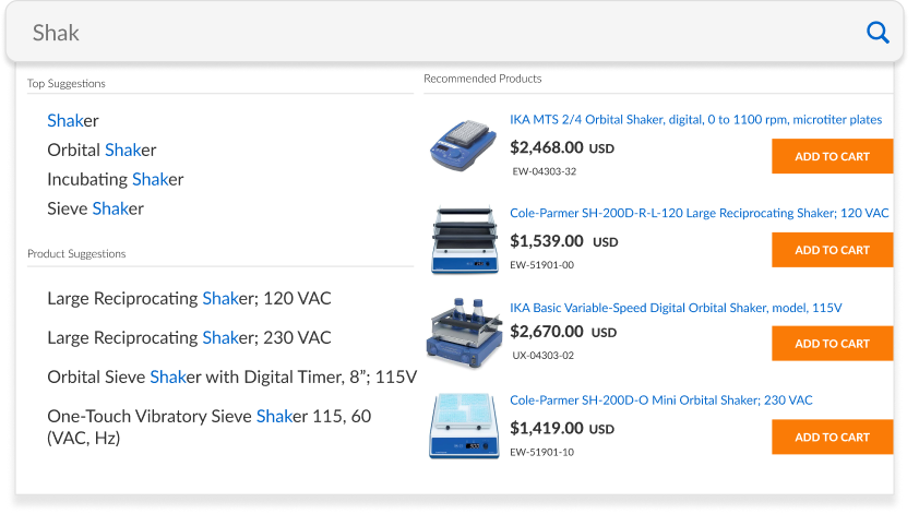
The legacy search experience primarily surfaced category links, requiring users to navigate deeper into the site before evaluating products. The redesigned interface instead surfaces individual products directly within the search results, pairing imagery with pricing and key details to support immediate recognition and faster comparison.
To further reduce friction, the interface introduced direct add-to-cart functionality within the search results. This allowed repeat purchasers and high-confidence users to complete tasks immediately while still preserving deeper product exploration for more complex decisions.
Design Handoff
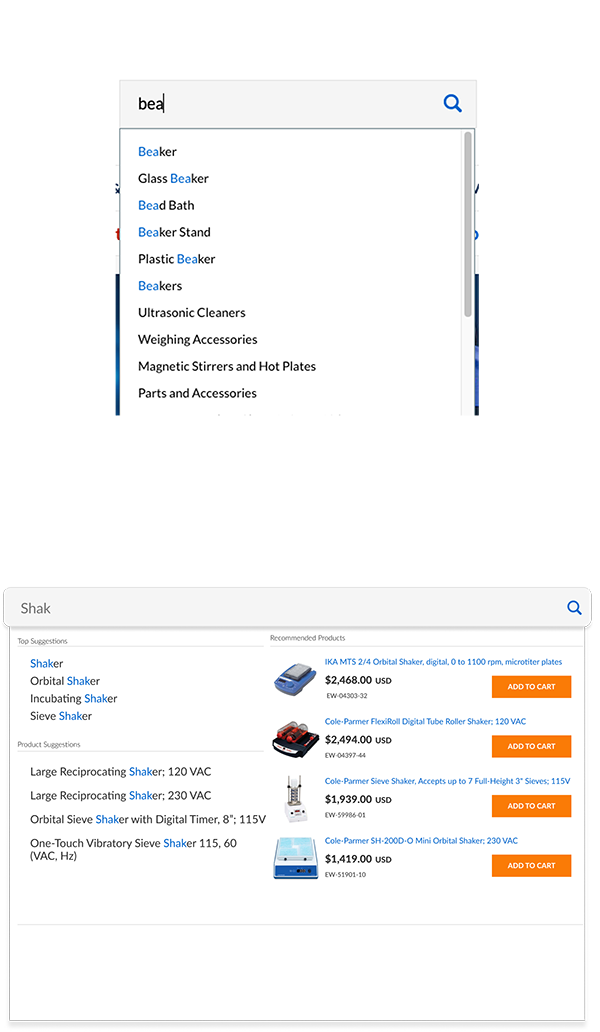
The project followed a structured design-to-development workflow to ensure the experience translated accurately into production. High-fidelity, pixel-perfect mockups were created in Figma alongside interactive prototypes that allowed the development team to explore the experience and understand intended behaviors.
Product cards, hover states, add-to-cart functionality, and result prioritization rules were carefully documented to communicate how users would interact with the interface. These interactive prototypes helped demonstrate navigation patterns, product discovery flows, and how users could quickly add items to their cart directly from search.
This structured handoff enabled developers to reference both precise layouts and real interaction patterns, ensuring the final implementation maintained the intended visual hierarchy and usability established during the design phase.
Key Take Aways
This project reinforced the importance of designing search experiences around how users actually identify products within complex technical catalogs. In many cases, visual recognition and quick access to pricing proved more effective than relying solely on category navigation or text-based suggestions.
Introducing product-level results directly within search shifted the experience from navigation to decision-making. Allowing users to evaluate products, compare options, and add items to the cart without leaving the search interface significantly reduced friction for repeat purchasers and high-intent users.
Most importantly, the project demonstrated how targeted interface improvements within a high-impact system like search can drive measurable business outcomes. The redesigned experience contributed to a 10% increase in search-driven revenue while improving the speed and confidence with which users could locate products within a catalog of more than 40,000 SKUs.
Check Out Some More Of My Work

Optimizing Enterprise Navigation & Search
Redesigned enterprise navigation and search to improve usability, account visibility, and product discovery.
C-PRISM
Cole-Parmer Resource for Interface & System Management
B2B Product Page Redesign
Restructured key product information to support faster decision-making and a more intuitive buying experience.
Visual Search for Complex Catalogs
Created a streamlined visual search flow for navigating large, high-SKU catalogs.
Homepage Redesign
Modernized a legacy homepage to improve clarity, visual hierarchy, and conversion performance for a high-traffic B2B website.

Augmented Reality Interface for NASA
Developed an AR interface prototype for the NASA SUITS competition.